Brand Identity
FC Hospital Branding is a brand identity redesign concept for a hospital, designed by Recipe Codes. The work covers a redrawn bilingual Arabic and English logo for Family Care Hospital, an old-versus-new logo comparison, a construction diagram, a three-colour blue palette and stationery mockups.
The project
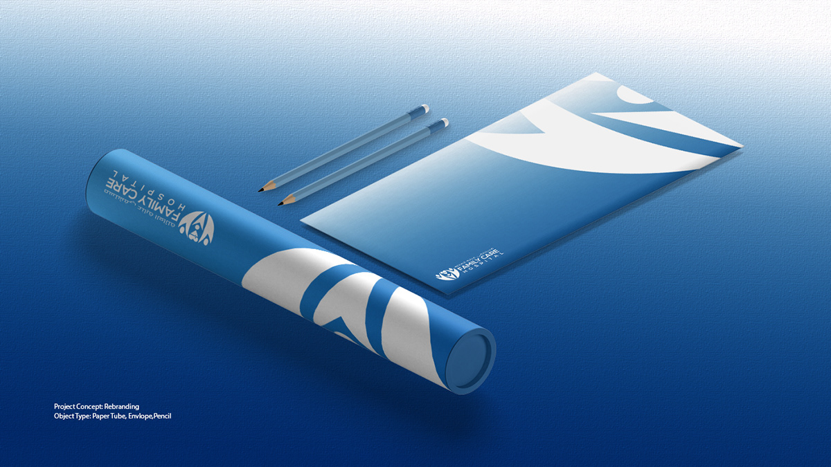
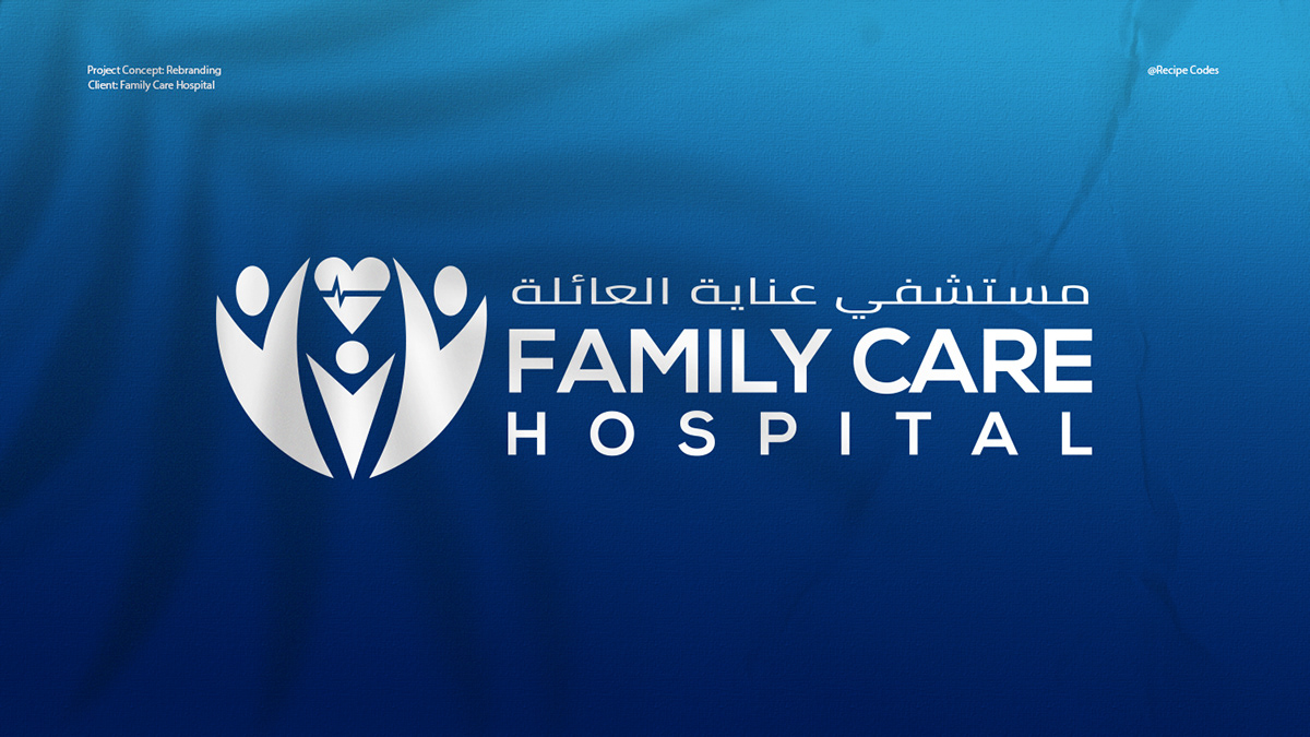
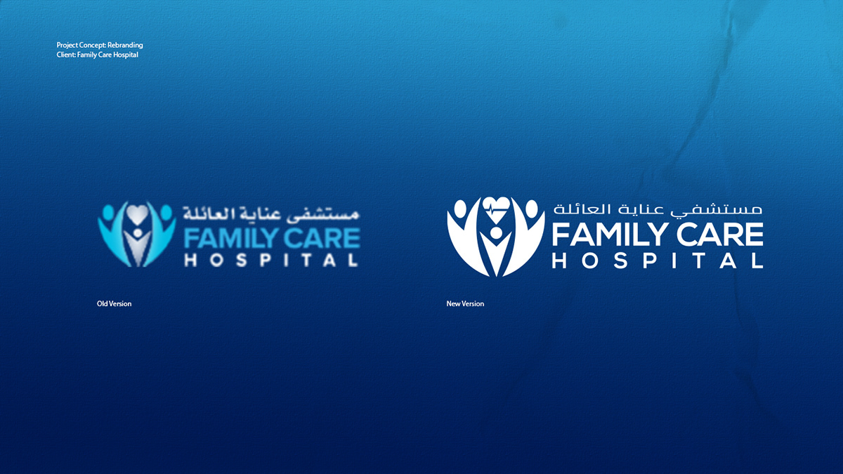
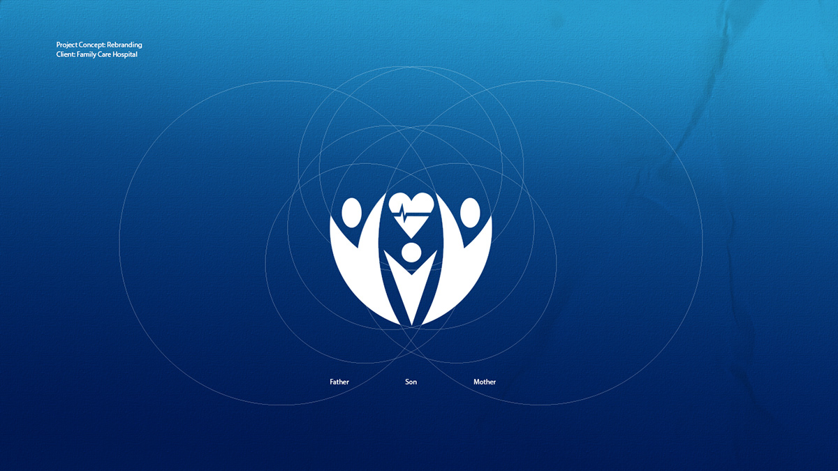
Recipe Codes created a rebranding concept for Family Care Hospital (مستشفى عناية العائلة). The project compares the previous logo with the redesigned version, documents the symbol's geometry with overlapping circles, and defines a colour palette. The new logo pairs the symbol with an Arabic name line above a bold 'FAMILY CARE' wordmark and a widely letter-spaced 'HOSPITAL'. A paper tube, envelope and pencils show the identity in print.
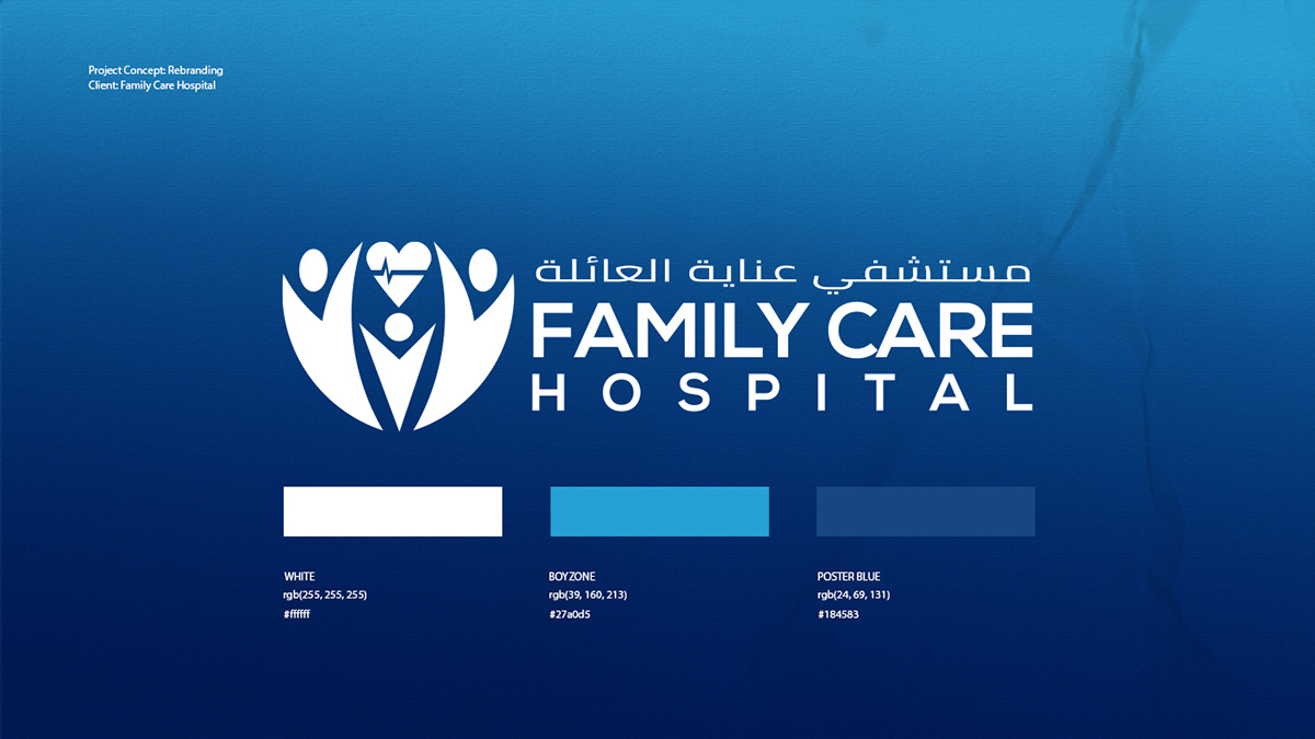
The symbol shows three human figures, labelled father, son and mother in the construction slide, drawn with arms raised around a heart that contains a heartbeat line. In the new version it is rendered in solid white on deep blue gradient backgrounds. The palette is documented as White (#ffffff), Boyzone blue (#27a0d5) and Poster Blue (#184583). English type is a heavy geometric sans-serif, with Arabic set above it.


Recipe Codes created a rebranding concept for Family Care Hospital. It includes a redrawn symbol of three figures around a heart with a heartbeat line, a bilingual Arabic and English logotype, an old-versus-new comparison, a construction diagram, a blue colour palette and stationery mockups.
The construction slide labels the three figures in the symbol as father, son and mother. They surround a heart containing a heartbeat line, linking the family theme of the name to healthcare.
Tell us about your project and our team will get back to you.