Brand Identity
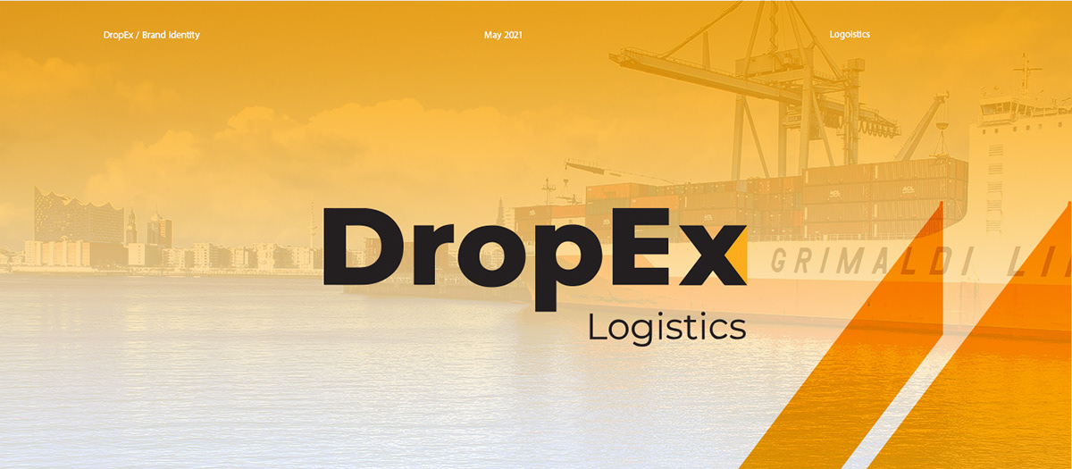
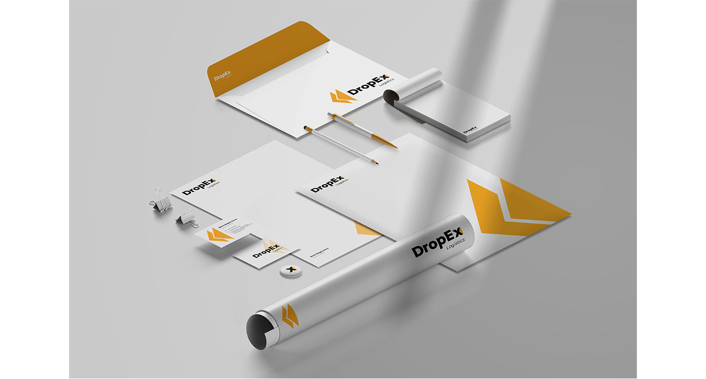
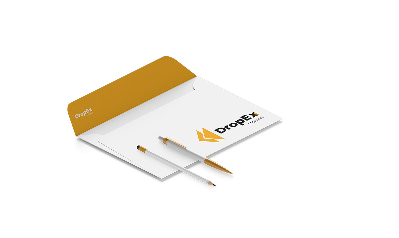
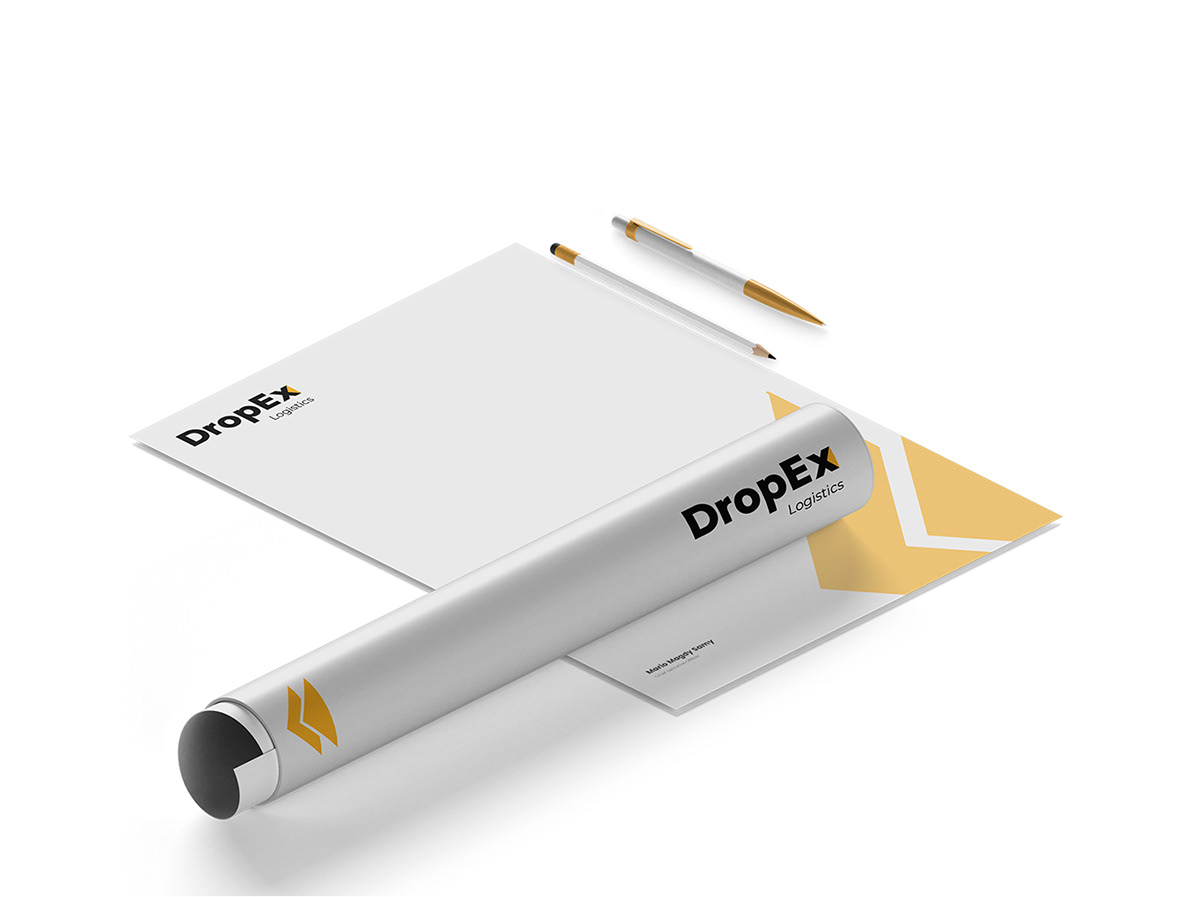
DropEx Brand Identity is a corporate identity for DropEx Logistics designed by Recipe Codes. The work covers an X monogram, the DropEx Logistics wordmark, a three-color palette, a chevron pattern and a printed stationery set including letterhead, envelope, business cards and a poster tube.
The project
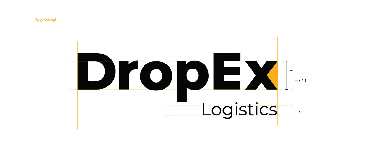
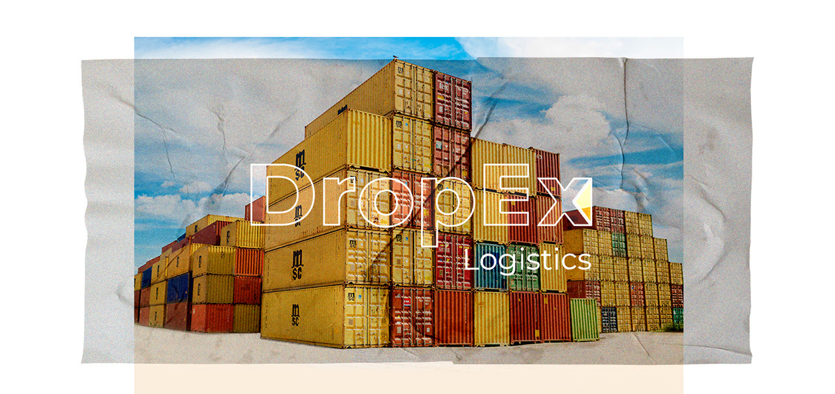
Recipe Codes created the corporate identity for DropEx, a logistics brand, as the Logistics descriptor under the wordmark and the shipping-port and container imagery make clear. The identity system includes a standalone X monogram, the full DropEx Logistics logotype with construction guides, a defined color palette, a repeating arrow pattern and stationery applications shown as print mockups.
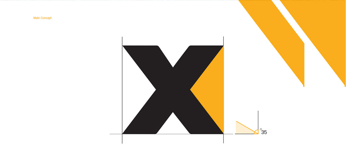
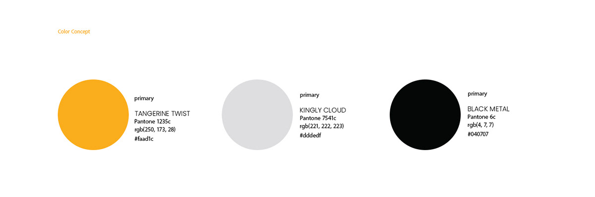
The X monogram is a heavy black letterform with a tangerine triangle cut into its right side, built on a 35-degree angle shown in the construction drawing. The wordmark uses a bold geometric sans serif, with Logistics set lighter beneath it. The palette is Tangerine Twist, Kingly Cloud gray and Black Metal. Chevron arrows in tangerine form a pattern that suggests forward movement, and the same diagonal shapes appear on the stationery.


Recipe Codes designed the corporate identity for DropEx Logistics: an X monogram with a tangerine triangle, a bold wordmark with construction guides, a tangerine, gray and black palette, a chevron pattern, and stationery including letterhead, envelope, business cards and a poster tube.
The palette has three primary colors named in the brand sheet: Tangerine Twist, a warm orange-yellow; Kingly Cloud, a light gray; and Black Metal, a near black. Tangerine carries the monogram accent and the chevron pattern.
Tell us about your project and our team will get back to you.