Brand Identity
Link School Brand Identity is a visual identity and brand guideline designed by Recipe Codes for Link School, presented as an office supplies brand. The work covers the logo, clear space, placement and usage rules, an orange and purple palette, patterns, imagery style, stationery and printed elements such as banners.
The project
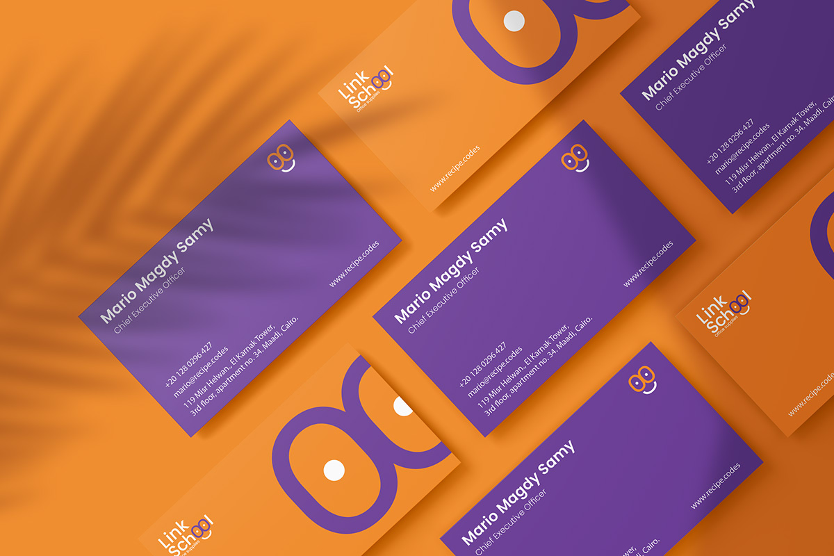
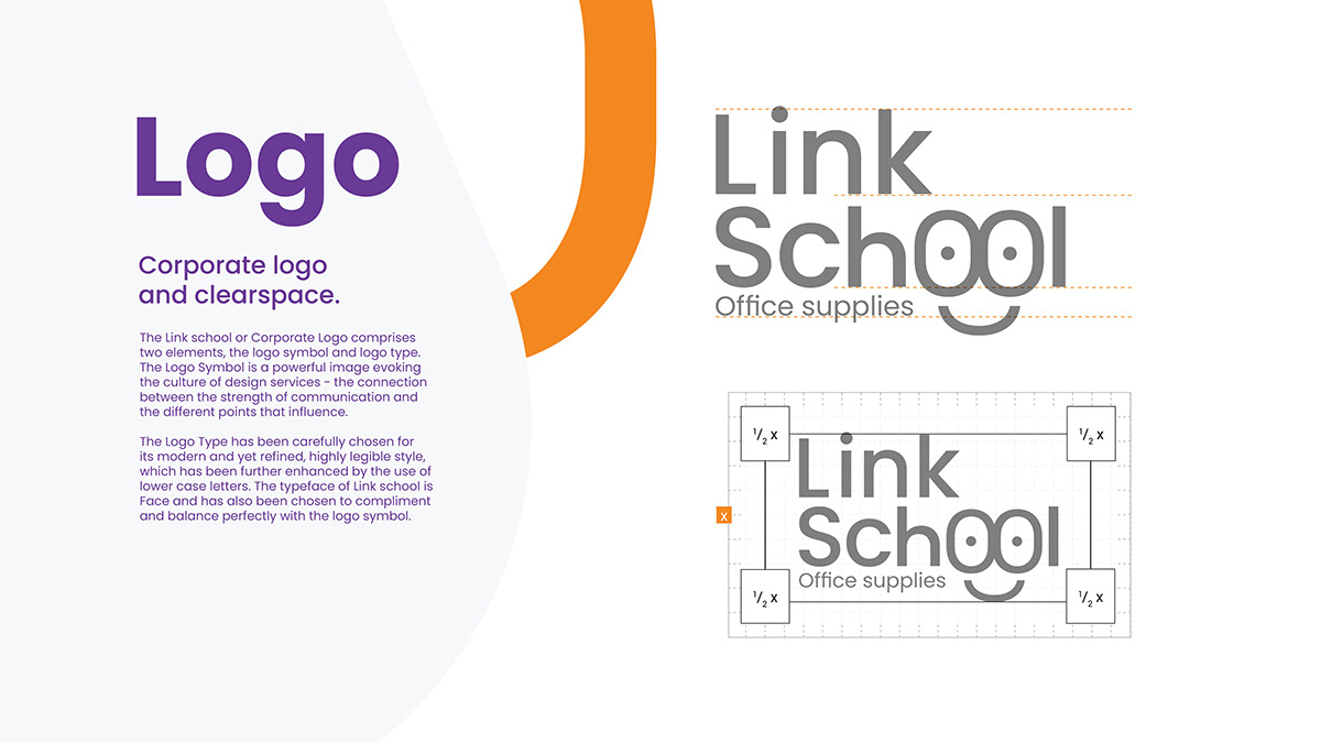
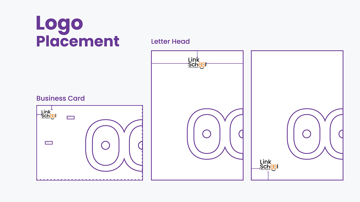
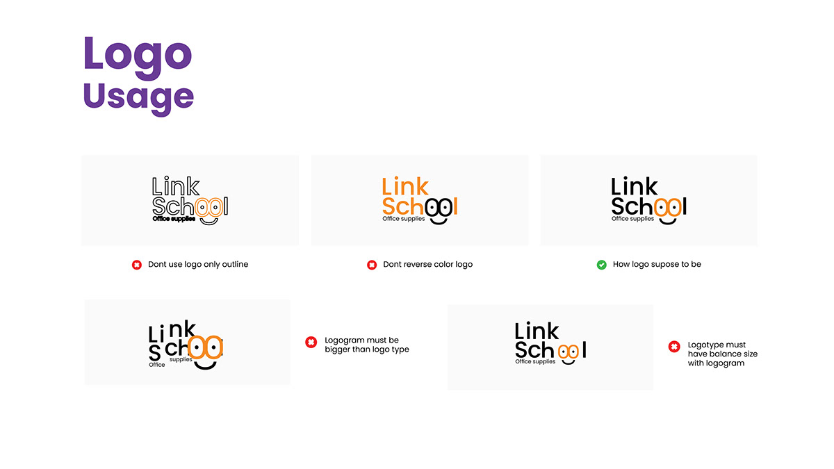
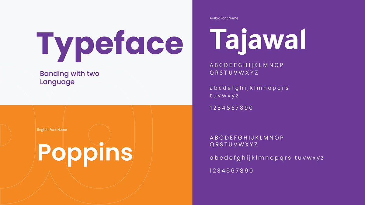
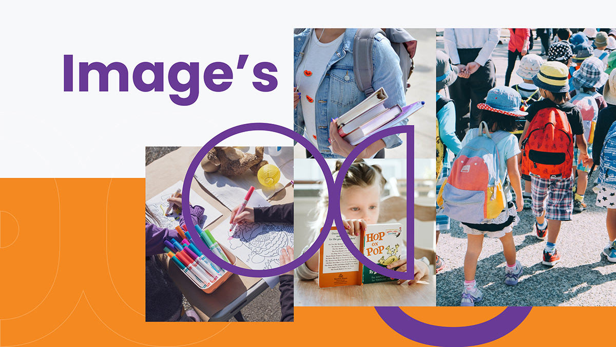
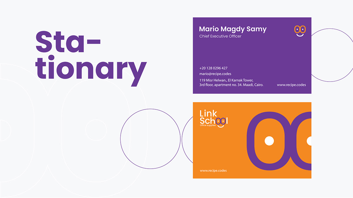
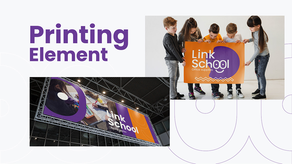
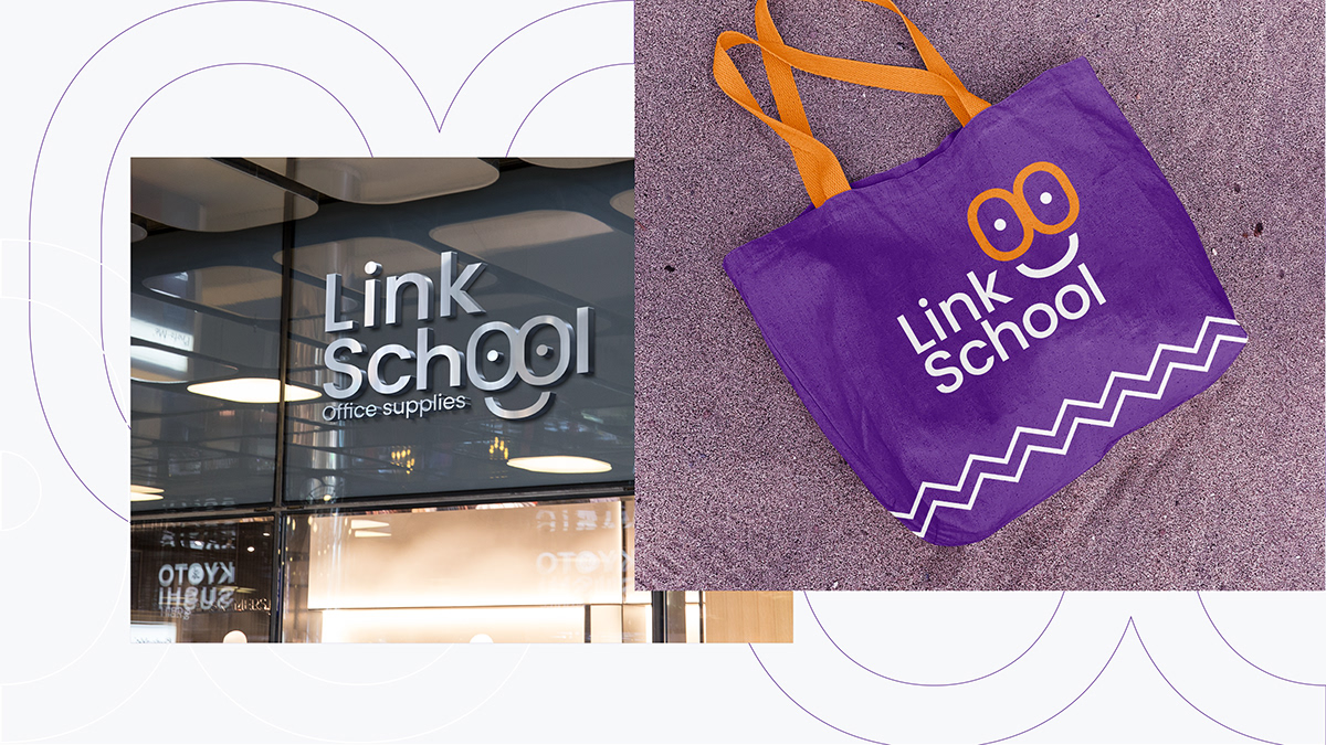
Recipe Codes designed a brand identity and brand guideline book for Link School, whose logo carries the descriptor Office supplies. The guideline pages cover the corporate logo and clear space, logo placement on business cards and letterheads, correct and incorrect logo usage, color philosophy, how to use color, brand patterns, an image style built around children and school life, stationery, and printed elements including banners and signage.
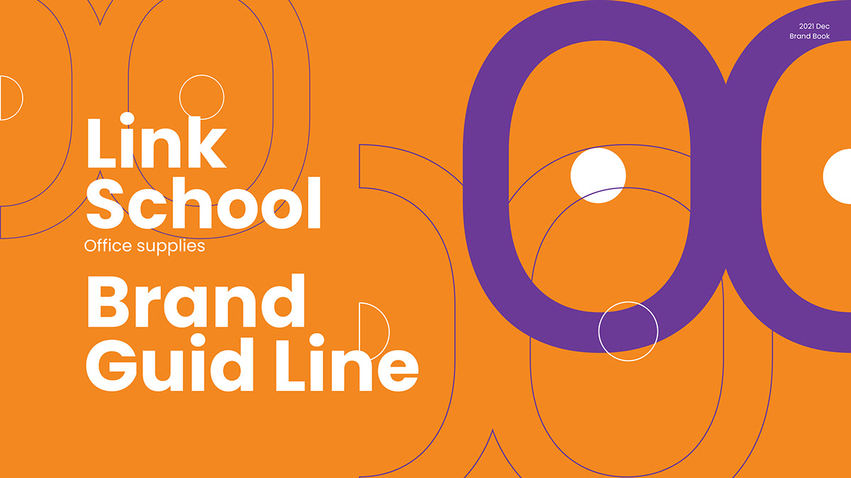
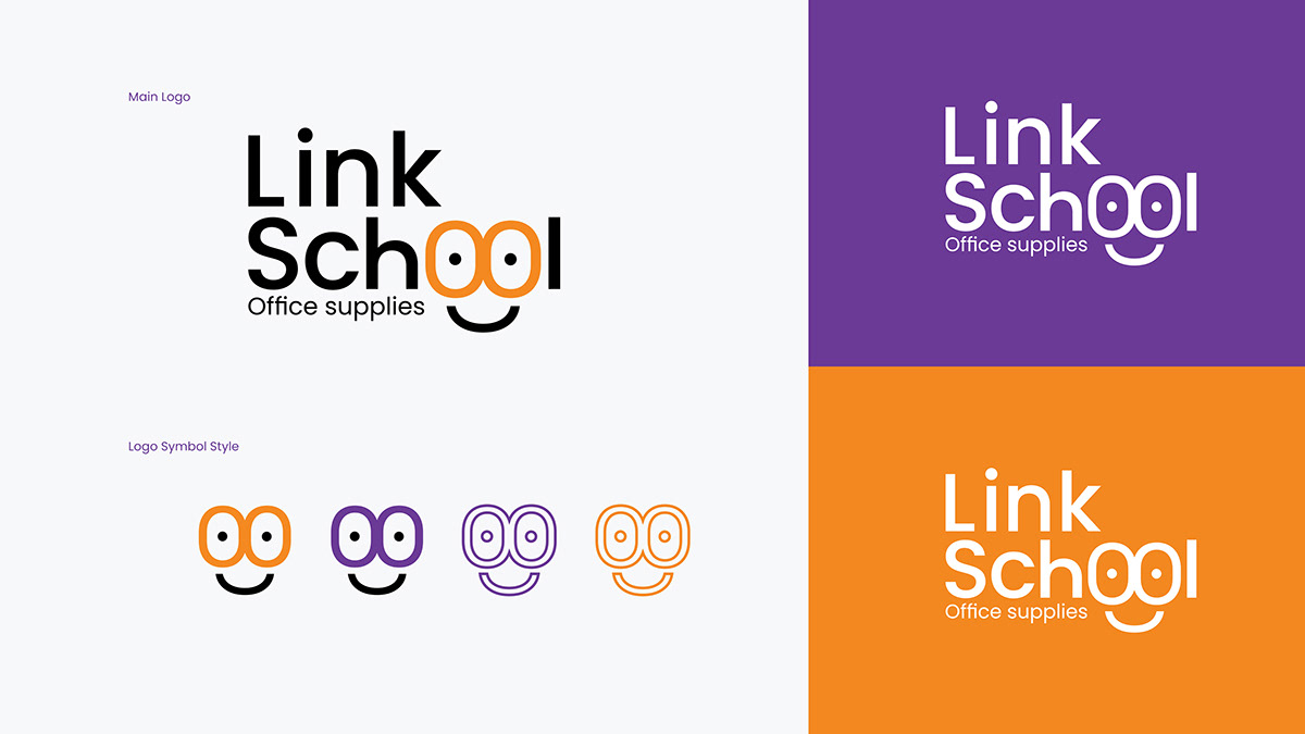
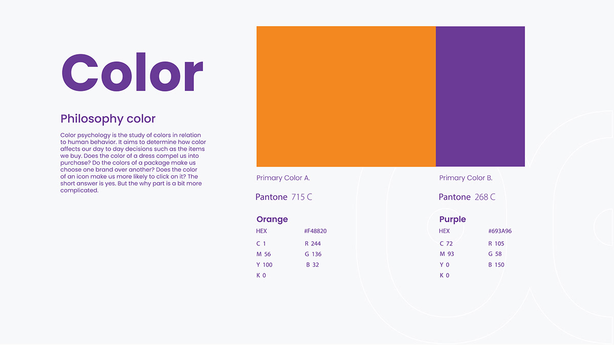
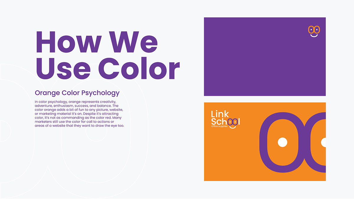
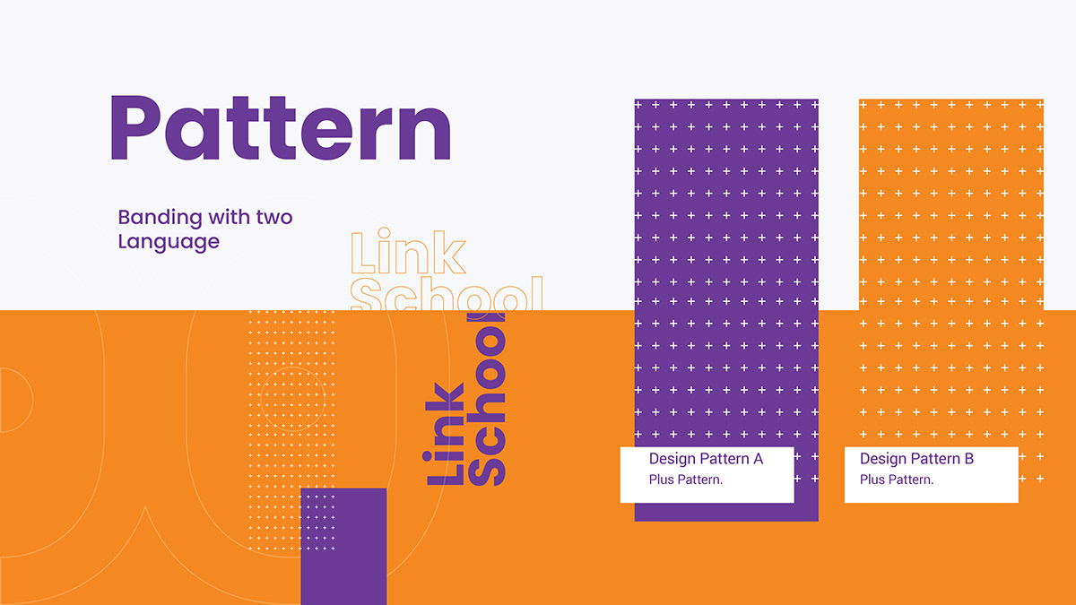
The logotype sets Link School in a rounded sans serif, with the double o in School drawn as two eyes over a smile, so the word reads as a friendly face. The palette pairs orange, Pantone 715 C, with purple, Pantone 268 C, used in large solid blocks. Oversized outlines of the double-o shape act as a graphic device on cards and covers, and two dot patterns extend the system for print.


Recipe Codes designed a brand identity and guideline book for Link School, an office supplies brand. It covers the smiling-face logo, clear space and usage rules, an orange and purple palette, patterns, image style, stationery and printed elements such as banners and signage.
The guideline includes pages for logo and clear space, logo placement, logo usage, color philosophy, how to use color, patterns, images, stationery and printing elements, each laid out in the brand's orange and purple.
Tell us about your project and our team will get back to you.